
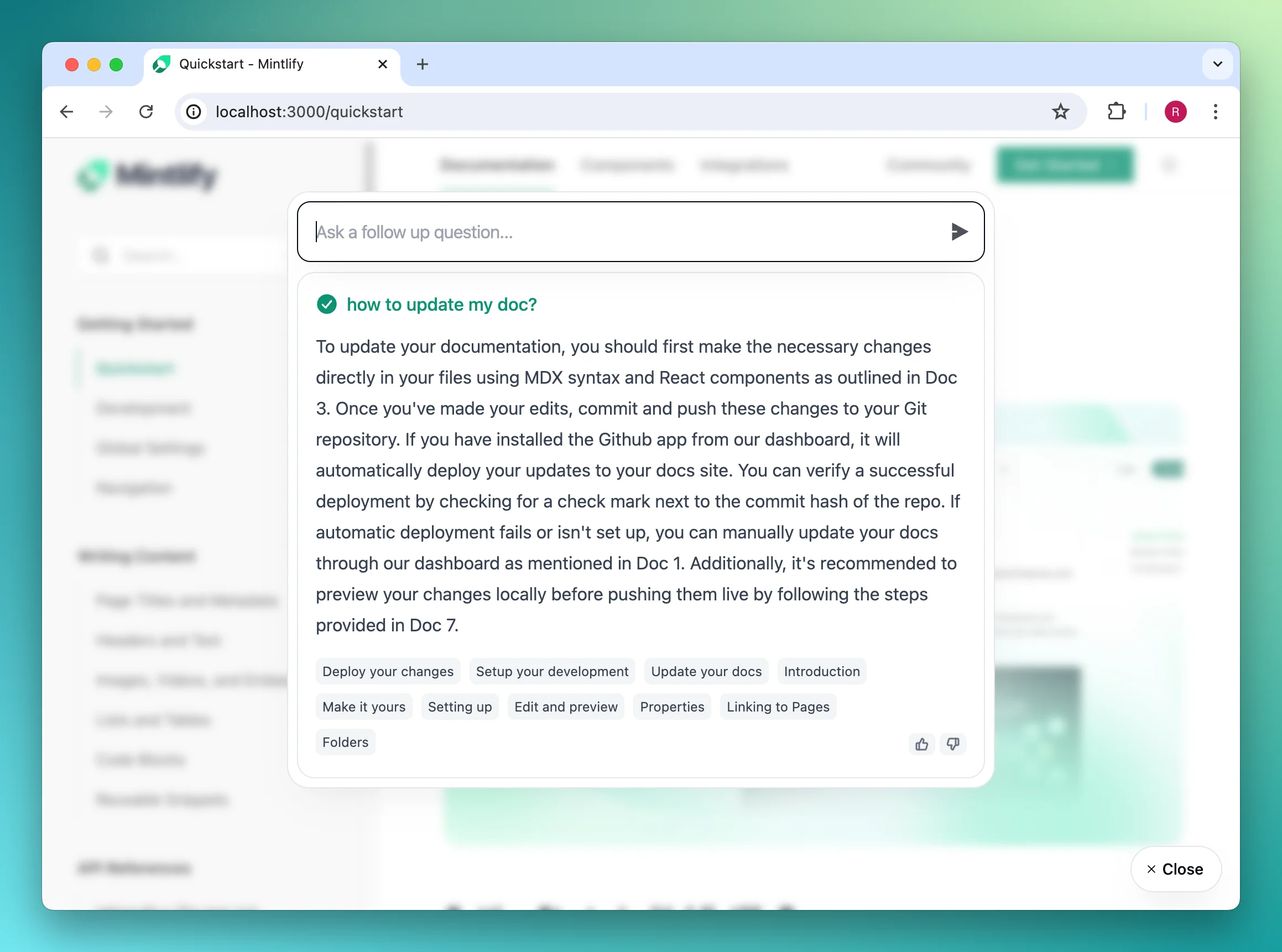
Documentation Index
Fetch the complete documentation index at: https://mintlify-delete-quickstart-page-389072bb.mintlify.app/llms.txt
Use this file to discover all available pages before exploring further.

Getting started
First, generate an API key in the Mintlify dashboard.
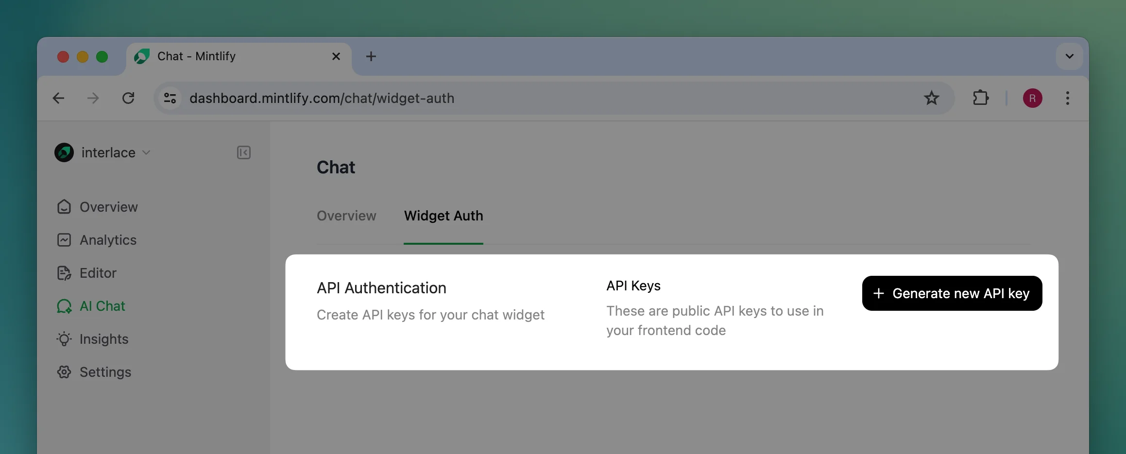
Installation
Add the widget by adding these script tags into your site’s<head>...<head/> tag.
@mintlify/widget-react package. Here is a basic example of how to use the component in your React application:
Usage
In the first script tag or the React component props, you can customize the appearance and other settings of the widget.mintlifyWidgetSettings accepts the following props:
| Prop | Type | Description |
|---|---|---|
connection | MintlifyWidgetConnectionProps | Information needed to connect to our API. Required. |
display? | MintlifyWidgetDisplayProps | Configurations for the widget appearance and interactions. |
tracking? | MintlifyWidgetTrackingFunctions | Callback functions for tracking analytics. |
MintlifyWidgetConnectionProps
| Prop | Type | Description |
|---|---|---|
apiKey | string | Widget API key generated from Mintlify dashboard. Required. |
url? | string | Used for internal testing only |
MintlifyWidgetDisplayProps
| Prop | Type | Description |
|---|---|---|
trigger? | MintlifyWidgetDisplayTriggerProps | Appearance of the trigger. |
colors? | MintlifyWidgetDisplayColorsProps | Colors used across the widget. |
chat? | MintlifyWidgetDisplayChatProps | Configs specific to AI chat. |
isDarkMode? | boolean | Controlled dark mode appearance. Defaults to OS preference. |
MintlifyWidgetDisplayTriggerProps
| Prop | Type | Description |
|---|---|---|
type? | 'button'|'input' | Type of the trigger to display. Defaults to button. |
label? | string | Label displayed in the trigger. Defaults to Get help for the button trigger and Ask anything... for the input trigger. |
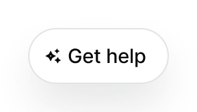
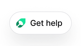
buttonIcon? | 'chat'|'sparkles'|'mintlify' | Icon used in the trigger. Only available for the button trigger. Defaults to chat. |
iconOnly? | boolean | Only show icon in the trigger or not. Defaults to false. |
type='input' | |
|---|---|
![]() |
type='button' | 'chat' | 'sparkles' | 'mintlify' |
|---|---|---|---|
iconOnly=false | ![]() | ![]() | ![]() |
iconOnly=true |
MintlifyWidgetDisplayColorsProps
| Prop | Type | Description |
|---|---|---|
primary? | string | Primary color used in the widget. Defaults to #0D9373. |
primaryLight? | string | Primary color in dark mode. Defaults to #55D799. |
MintlifyWidgetDisplayChatProps
| Prop | Type | Description |
|---|---|---|
openCitationInSameTab? | boolean | Open the citation url in the same tab or not. Defaults to false. |
exampleQueries? | string[] | Example queries to prompt the user to ask. Defaults to []. |
MintlifyWidgetTrackingFunctions
| Prop | Type | Description |
|---|---|---|
trackChatEnter | ()=> void | Triggered when the user opens the chat widget. |
trackCitationClick | (title: string, url: string)=> void | Triggered when the user clicks on a citation. |
trackChatThumbsUp | (query: string, response: string)=> void | Triggered when the user thumbs up on a response. |
trackChatThumbsDown | (query: string, response: string)=> void | Triggered when the user thumbs down on a response. |
trackChatFollowup | (query: string)=> void | Triggered when the user asks a question. |
trackChatClose | (queriesCount: number)=> void | Triggered when the user exits the chat widget. |